
Tap, drag, flick, spread! While many of us might not know these in-app gestures by name, though we use them daily while interacting with our mobile apps.
And considering that gestures have become an important UI feature, they too are evolving!
Let’s take example of iPhone 3D Touch and one of its applications called peek-and-pop. This feature allow users to sneak into the content when a light force touch is applied and making the touch a little harder will open it.
As these gestures improve, they are giving more power to the UX and usability. With gestures, apps can be empowered with more functionality, with lesser inputs. And when the app is interactive and powerful, it is likely to get user attention, more retention, and ability to make a space in the hyper-competitive marketplace.
So, these gestures are creative, improve usability and what not for UX. But, how will your users know about them?
If any of your app functionality uses gestures in a way that’s not usual for the users, they need some hint to use them, or there is some new kind of gesture introduced in the app (like 3D touch happened in iPhone), then informing the users about them is important.
There are a number of ways to tweak the mobile app design and let the users know how they can use the in-app gestures. Let’s discuss some of the ways to enlighten your users about the gestures
a) Create Walkthrough/Tutorial
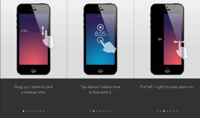
User Interface (UI) is not obvious all the time. Therefore, you need to give your users a hint about how it works. If your app is gesture-driven, then you can let the users inform about their usability through short tutorials or walkthroughs. When following this approach, there are few things to consider, like:
- Walkthroughs are not the user manual of an app. So, keep them short and precise.
- Since users cannot remember a lot of things at once, inform them about 2-3 things at once.
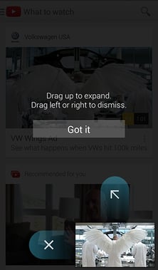
Here is an example from Youtube app about how exactly the walkthrough for in-app gestures should be:
One more example:
b) Educate Users in Context
This technique is useful if users have to interact with an element of app in an unusual way. For this, you can use slight visuals or animations. Here is how:
- Give a Plain Text Command: This will prompt users to perform a gesture and explain the result of it through a short description. In the example below, see how swiping to right will dismiss the notification.
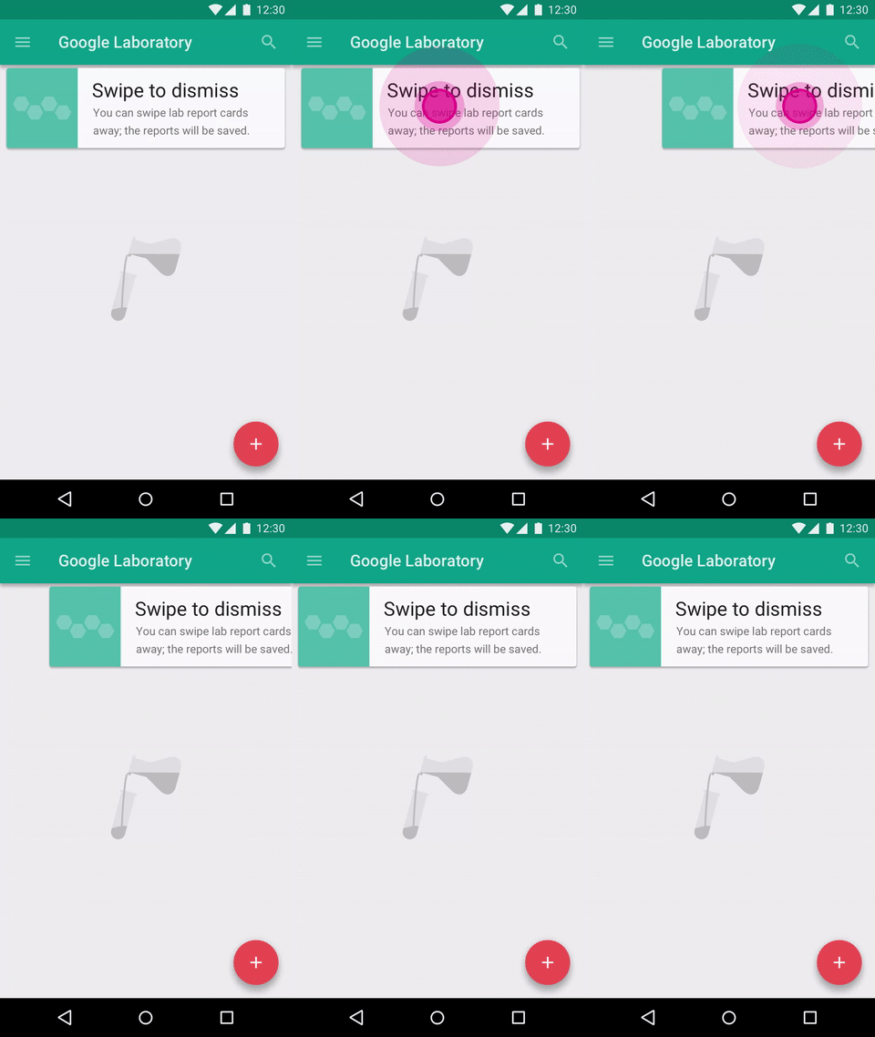
Credits:Material Design
TIP: Keep the description short and crisp. This will provoke users to read the text first and then perform the action.
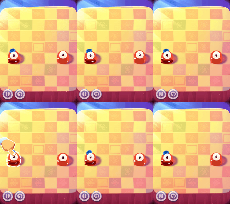
- Give a Clue through Motion: With this, you can give users a preview of how to interact with an element in the app. To exemplify, here is how the Pudding Monster, a gaming app that gives clue to its users like this.
c) Create Content Teasers
You can create visual clues for what is possible on a particular screen. In the example shared below, content teasers for the cards are created that gives users a clue that there are other cards behind the current card and users can access them through swiping.

Credits:Dribble
What’s your Way to Communicate Hidden Gestures to Users?
In the attempt to introduce the in-app gestures to the users, the examples shared above will work. However, the idea is to keep it simple, subtle, and understand that what works in one app might not work in another. Keep into consideration the type of app and if it is required to even inform users about it. Inform users, only when an unusual way of using gesture is added to the app. This will keep the app flow seamless.


