The difference between apps that make millions and the ones that never see a dime lies in the fact that how well their developers and marketers understand their customers. With a million apps in the app stores, the need to understand user’s pressing points has never been so important than now.
If a survey by Forrester Research (Paid Report) is to be believed, smartphone owners in US and UK use on average 24 apps in a month. But surprisingly, they spend 80% of their in-app time on just 5 apps. Hence, the majority of the applications installed by the users are never used more than once.
What does those apps have in different that captivate their users? Why do these apps click in the user’s minds when they want to accomplish a particular task?
The answer lies in understanding their user’s demographics and psychographics, and eventually, crafting a user experience that appeals to their needs and emotions.
Listed below are 4 techniques that you can inplement in your mobile app UX design to engage them anf have better retention rate.
1. Usable architecture rather than aesthetics
The problem is, most of the product owners want to wow their users with the aesthetics of their mobile app, rather than its core usability. They focus on making their app aesthetically appealing rather than functionally appealing. And in the process to do so, they completely sideline the user experience.
Visual impact can earn you that ‘wow’ impact you are looking for from your users, but as soon as they get in, and find you app unusable, you’re gonna lose them forever.
The point is, it's more rewarding to have a mediocre visual design than a mediocre user experience, but not the other way around.
2. Don’t underestimate the power of colors
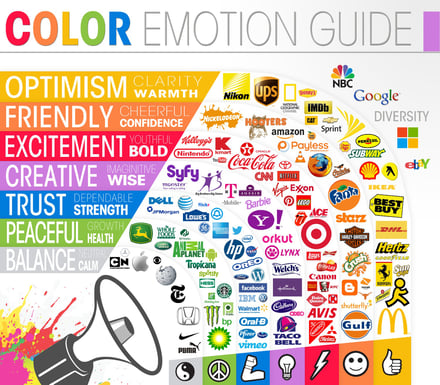
Colour is indubitably the most critical aspect of your mobile app after functionality. It is central to the design philosophy and each color has the ability to impact the user’s behaviour.
Choosing the right color palette for your app can be the difference between designing a meditation app that soothes the user’s eyes and the one that makes them bang their phone on the ground.

A study conducted by University of Toronto says that most people prefer simple color combinations that contained not more than two or three color schemes. However, make sure it is consistent to your brand’s color identity.
3. Focus on what people use, not on that they say
To design the most usable UI, analyze what your users do instead of what they say. There can be a gulf of difference between the two.
The most sluggish approach that product owners take is creating a few design options, showing them to a few users (and in some cases not even the actual users), and asking them which one to prefer. A blunder indeed.
If the users have not actually used the designs, they will merely comment on the face value. Which goes south with feedback obtained on real use.
The most useful tool to figure out what people use is Google Analytics. The behaviour flow section is a treasure trove when it comes to analyzing user behaviour.
4. Strive to create an emotional connection between your brand and the user
“To create valuable, sustainable customer relationships, great brands don’t sell customers on contracts—they seduce them with connections." from Forbes.
MS Word works the same on Windows as it works on a Mac. Yet here I sit, writing this blog post on my Macbook. Why? Because I have my emotions attached to it.
So what creates this sense of connection?
Apple’s branding strategy uses simplicity, a clean design and most importantly, a desire to become part of a luxurious lifestyle.Their well-crafted messaging appeals to one of the most basic emotional need of users: to be part of something bigger than ourselves.
A user who had a good experience with your app tends to turn an advocate for your brand; recommend you to others and continues to buy from you.


