A Search Box is one of the most powerful, yet an underestimated element of a mobile app. While it’s a simple textbox with an input field and submit button, it needs to be presented well to its users, for the fact that it’s used very often (especially in apps that are content-heavy).
For a mobile UX designer, a search box and its usability is a big deal. Here we discuss a few practices that can help to create a winning search box for a mobile app.
1. Search Bar should be Clearly Visible
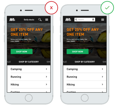
If something is meant for users, they should be able to spot it easily. Make sure that the search box in your app is prominently visible to your users. Consider the following example:
In Case I, the search functionality is hidden behind the menu bar. While is Case II, users can easily locate the search box and use it accordingly.

2. Don’t Use Progressive Disclosures
It is always a good practice to consider that your user is a newbie to the app world. If the app is developed for generation X, Y, Z (say an eCommerce app), then it is a crucial step to have UX design that works for everyone. When designing a search box, don’t hide the search feature behind the magnifying glass icon. Instead, display the icon in a text box.
![]()
3. Add a CTA to the Search Box
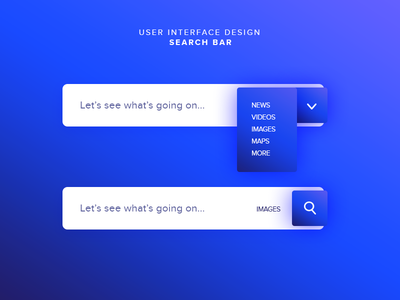
If you add a button alongside the textbox, it will help users understand that an additional step is needed to trigger the search process.

TIP: Tapping on the search button can be optional. You can also allow users to start search by tapping the Enter key.
4. Use Auto-Suggestion in Search Results
Helping users to find the product that they want is a great business move and auto-suggestion mechanism will help you do just that. The auto-suggest mechanism in the search box guide users to construct a query that is in proximity to their requirement. Generally, uses find it difficult to formulate a query and therefore, reaches the required product, solution, or service after hopping a lot within the app. And very often, they give up. Hence, giving attention to auto-correct mechanism in the search box is imperative. Meanwhile, you can follow the following suggestions:
- Make sure that you provide auto-suggestions to the users, as soon as possible.
- Too much suggestions will not only confuse users but will impact the UI as well.
- Highlight how your suggestions match or are around the recommended results

5. Give Adequate Field Size to Users
You cannot predict the way users formulate queries. They can type a three word query or can enter long queries as well. In between, they may change the query as well. That is why it is important that adequate space is given to the users to type or edit their query.

6. Search Box Placement is Important
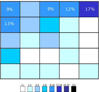
A few things are obvious and one of them is the position where users are likely to find the search box. Users should search the products and not the search box. When designing UX design, blending it with human psychology is imperative. Studies suggest that top left and top right are the most common positions where user expect the search box to be.

![]() Percentage of users choosing a grid square
Percentage of users choosing a grid square
ALSO READ: How to Blend UI/UX with Human Psychology during Mobile App Development
7. Let the Users Refine Search
If possible, help your users in refining their search. You can let them sort the output by specific criteria. Here is an example of how you can do it:

Conclusion:
If your app is content-heavy, having a well-designed search box is a must. The UX designing tips shared above will surely lead your way in adding worth the search box. Little things matter. Try these tips and share your experience in the comments below.


