“A picture is worth a thousand words. An interface is worth a thousand pictures.”
Design-led businesses swear by the principles and processes that have a human-centered core. Design thinking, which is a creative problem-solving approach enables businesses to focus on the people they are creating for. This, consequently, leads to better products, services, and internal processes.
At Daffodil, we use the design thinking approach in every stage of software development, right from research & strategy to building content. We think beyond transactions and create beautiful experiences that help businesses build lasting and significant relationships with customers.
Recently, the product design & development team at Daffodil Software decided to work on a challenging exercise of its own accord. In order to showcase the strength of our design thinking approach, we chose to redesign a popular app; ZocDoc*. The aim was to level up the user experience while negating the pertaining drop-offs.
Zocdoc is an online appointment booking portal that allows individuals to find a doctor and book an appointment, as early as 24 hours. Founded in the year 2007, this digital health marketplace monthly facilitates 6 million users to book an appointment with doctors in 2000+ cities across the United States.
Also Read: How ZocDoc Works: Business Model and Revenue Streams
The Objective
The objective of this exercise was to:
-
Redesign the existing website to decrease the booking time by eliminating the drop offs from the user journey.
-
Enhance the user experience with the right amount of minimal, clutter-free, and state-of-the-art design.
-
Create a user-friendly design that captivates its users. Also, it should improve the core with elements such as colors, typography, and design elements pivoting around it.
Let us now walk through the design aspect of the exercise which aimed to redefine the meaning of consumer products and reimagined the experience that goes with it.
The Design
Zocdoc is a product that uses information provided by the patient to make admissible recommendations for the selection of doctors, so the patient is more informed with taking decisions.
The product is the very heart of a good design that builds great brands and experiences. To morph this thought into reality, the design needed to be clean, over an intuitive card-based layout to improve the user’s focus while relieving them of arbitrary experience they are used to with other appointment booking products.
This redesign activity aimed to reduce the booking time for the patient. Eliminate the drop offs of the patient while they navigated within the app. Needless to say that the experience had to be astounding, aided by minimal, clean, and modern design with core design activities including color, typography, and design elements.
Brand Colours
The importance of color design originates from the significance of color to our human minds. The colors are tools to create certain emotions, express messages, generate ideas, and spark interest.
Some of the colors carry universal significance, for example, red is a color for warning, and green means go. However, red and green when put together, most people would associate the combination with Christmas. Bright colors tend to set a happier and positive mood, whereas dark colors tend to project the opposite. The psychology of colors states- warm colors display excitement, creativity, and optimism whereas cool colors symbolize harmony, peace, and calmness.
The task at hand was to refresh the user experience and visual design to consolidate all the features and build a foundation for the future. For this exercise, a total of 8 colors were used. These colors were used to redesign discovery and the reading experience for a user.
Below is the color palette used for this exercise.
Typography
Typography is a form of art that involves the amalgamation of a typeface in numerous combinations of fonts, sizes, and spacing colluding to give a voice to the whole picture. We see it all around us, in a wide range of designs such as a brochure, websites, print, books and computer graphics, etc. depending on the skillful use of typography to create an impact on the reader. If you're interested in creating compelling flyers, you might want to explore a flyer creator for more creative possibilities.
Designers use typography to blend the text within the design, creating content with a purpose. A well-thought-out use of typography allows the designer to make a design look aesthetic and pleasing to the eye.
In today’s competitive landscape, brands are finding avenues to create their distinctive identities. To convey the brand message the creative content must be able to grab the reader’s attention.
The typography used in this exercise
Visual Design
Visual design is a technique to enhance a design’s/product’s aesthetic appeal and usability with a suitable set of images, typography, space, layout, and color. It is just not all about the aesthetics, but the elements which are carefully placed to create an interface that optimizes a reader’s experience and eventually drives conversion.
The catch for us was to create a visually appealing system that would allow the Zocdoc to remain fresh and interesting every day.
A readers’ first impression frequently forms in around 50 milliseconds. This fact reveals the intellectual level of emotional design, which also means the reader’s first impression of or the gut reaction to a design. This meant that we only had 50 milliseconds to prove to the patient they were on the right website.
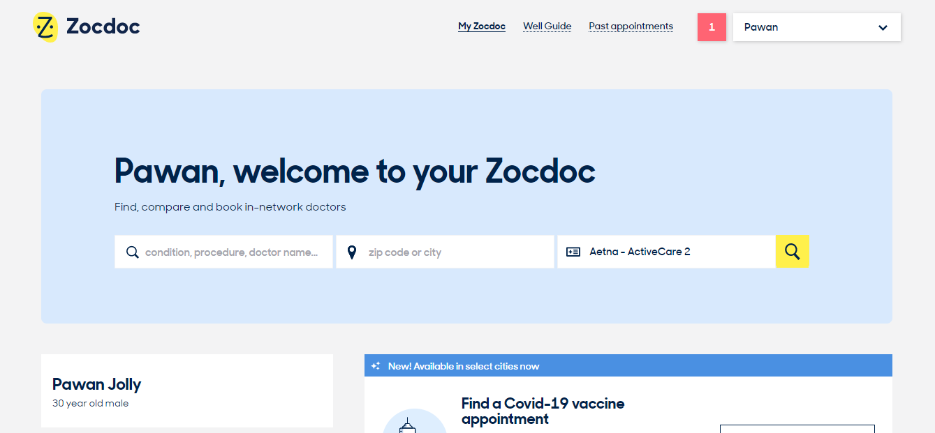
Existing homescreen of Zocdoc application
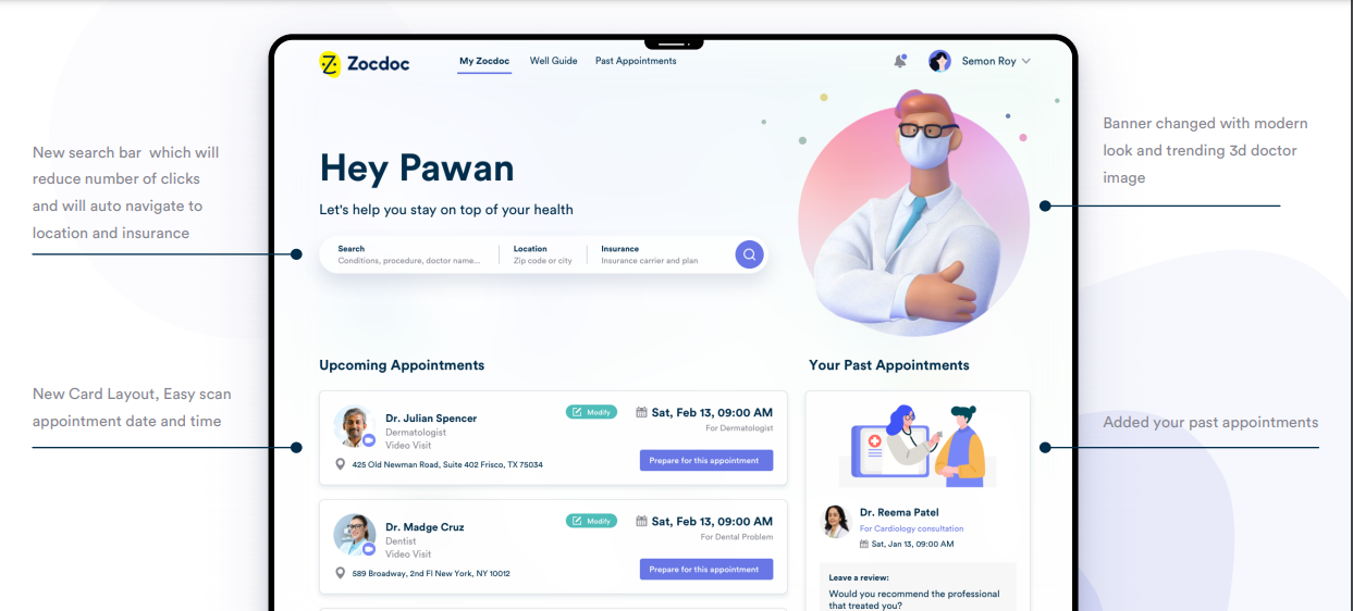
This is the redesigned end result of current system with modern, clean and minimalistic visual experience.
Many people are often mistaken that the design elements used are just to maximize the appeal. However, in reality, visual design is used to lead the reader’s eye to an item’s functionality and make the aesthetics consistent. We created a feasible facelift that included the existing features and functionalities of the website. Using the current design system as a starting point, we worked on the primary visual layer to create a delightful user experience. We composed and arranged the site’s content around each page’s purpose to give off the right visual cues.
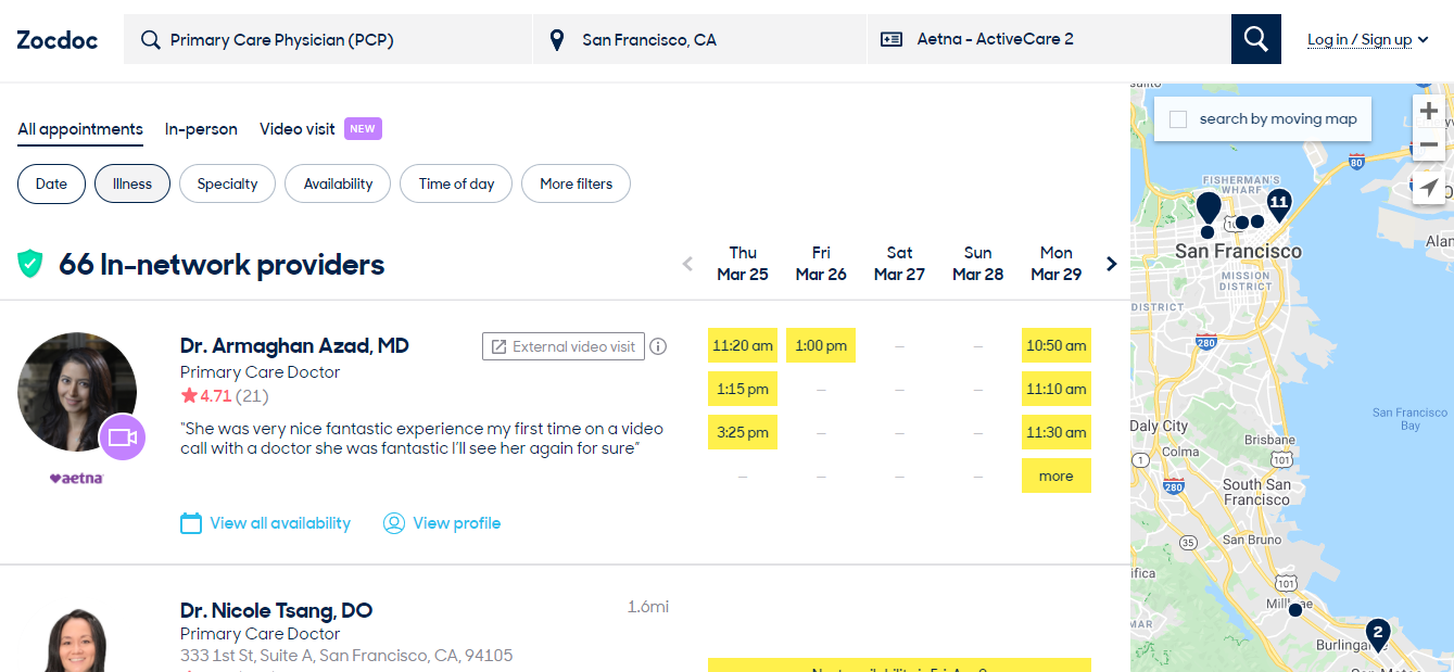
Existing doctor search result page
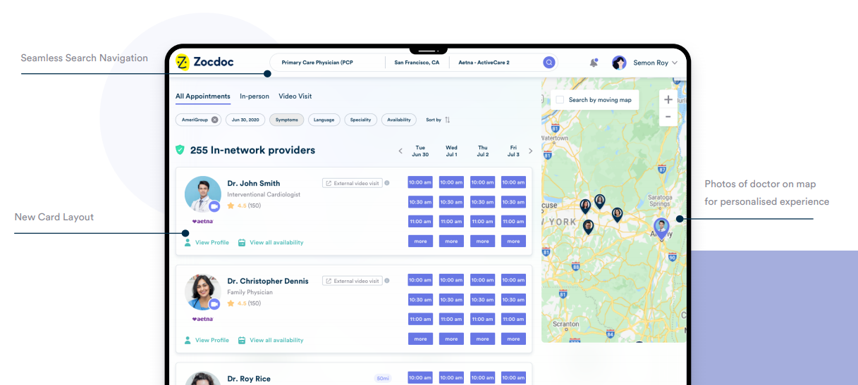
New doctor search result page with better usability and card layout helping patients to make quick decisions
Every smallest and subtlest detail affects what a reader thinks and feels. This was a criterion that led us to show the patients the right thing in the right way. Remember, the enemy here is the reader’s uncertainty. So we changed the primary color from yellow to a bluish shade of purple, as it is trending and goes very well with the healthcare industry. Yellow is not always pleasing for the reader and can strain their eyes.
Therefore, the design we created helped the patients focus on the important aspects of the website and struck a balance between a fresh, powerful design and something they expect to see from a doctor booking site.
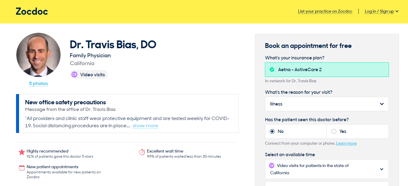
Existing profile design of Zocdoc web application
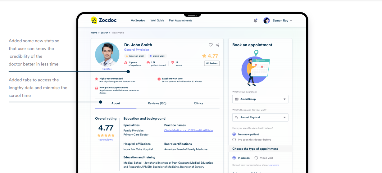
New profile design with new layout and added feature so that user can easily access the necessary information in one view
Conclusion
Visual design will depend on your product, its organization/industry, and its users, including their digital culture. A piece of knowledge I leave here with you today is that a major factor in designing is that you work to accommodate a reader’s limitation such as cognitive load. For example, the use of chunking help readers to understand and remember easily.
Just like we did for ZocDoc if you too want your brand design to be revised by our product design team to understand the impact it can bring on your business, connect with us. You can share your business details and requirements by setting up a free consultation call with our product design experts.
*Disclaimer: The intent of this post is to showcase the design expertise of Daffodil Software. We certify that ZocDoc or any of its associates is not our customer and this redesign has not been contracted by them. Our product design team revamped the application in its own accord.


