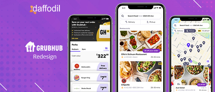
Grubhub is an online food delivery marketplace that connects over 33 million diners with their favorite food from local restaurants. The platform features more than 300,000 restaurant partners in over 4,000 U.S cities.
Grubhub processes more than 745,000 daily orders and covers 18% of the U.S. marketplace. With such great numbers and milestones, it is important that the users have a seamless experience with the one-and-only food ordering medium- their mobile and web apps.
That is why we are here- attempting to make Grubhub better for its users. In continuation to our series- Redesigning apps using design thinking, we will be identifying the pertaining issues with the Grubhub platform and apply the design thinking approach to improve the user experience of the app. Let’s get started.
UX Audit of Existing App
We started by analyzing the existing app to understand the UI/UX gaps in it. Following analysis were made by the UX auditing team:
Main Menu
- In the main menu, the user cannot choose the type of dish they are looking for.
- Discounts and offers are not visible. The images could have been more aesthetic.
- There is no segregation for a particular restaurant, cafe, or lounge.
- It is not possible to discover restaurants according to the meals.
Restaurant Page
- On the restaurant page, the user cannot select the portion of food items that they need.
- To read the description, the user has to land on another page in the app.
- There is no veg/non-veg sign on the food item. The UI isn’t properly designed to showcase the price of a food item.
Ordering Page
The user experience on this page is not up to the mark. The users have to figure out that swiping left will allow them to edit or delete a food item in the cart.
What do Users have to Say?
Based on our research, we discovered that the users have the following hindrances in the usability context:
- They cannot add any condiments as per their reference, whether available or not.
- Maximum restaurants are showing close but still can be seen on the home page.
- The UI is cluttered with a bad UX. It seems heavy on the eyes.
- The users have to hop a lot within the app to find the most appropriate restaurant to order a dish.
Objectives:
1. To enhance the user experience of the current app in accordance with the UX issues discovered during the audit.
2. To create a clutter-free app experience that bridges the gap between owners of the restaurant and users of the app.
Persona:
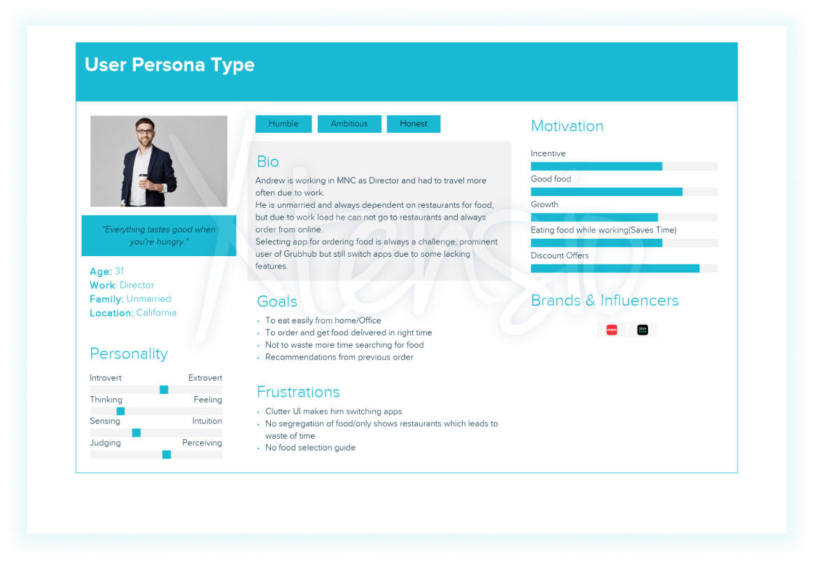
Andrew - 31, is dependent on restaurants for food and prefers ordering food online due to a hectic job schedule.
Marital Status: Unmarried
Location: California
Pain Points:
The UI is not friendly which makes him switch the food delivery apps often.
There is no segregation of food so that orders can be placed quickly according to the requirement.
How Might We (HMW):
- HMW make the app clutter-free
- HMW make sure to show all things which are necessary to order food
- HMW help user to discover restaurants as per their food choice
- HMW make sure to reduce time when user wants to order food
- HMW we add images to the app that takes user attention
Sketching:
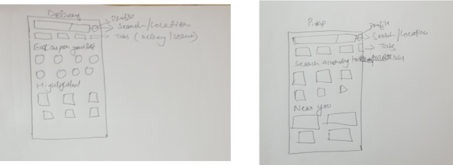
Our analysis was followed by some quick sketches that helped in better visualization of the solutions and get a better idea of feature placements and flow of the app.
Final Designs:
Delivery Page: 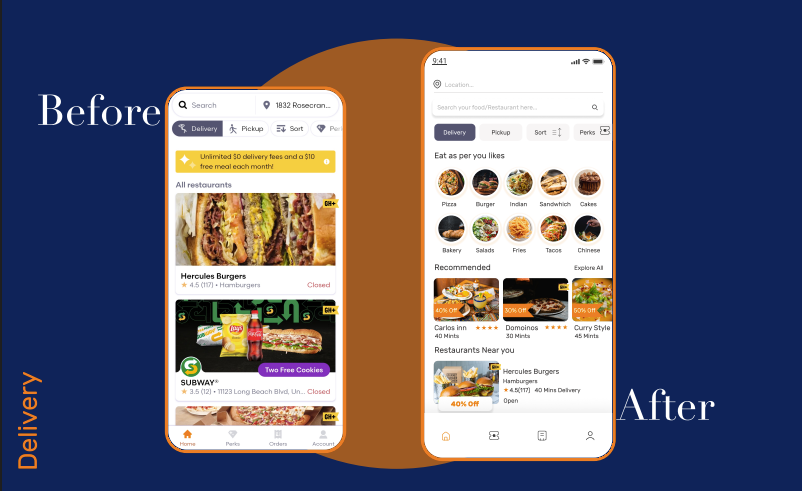
- We created a section that enables the users to order food. Users can search for food items from the main menu and reach their favorite restaurant.
- A new section called “Recommended” is added that helps the users to find the best restaurants according to their food search.
- Nearby restaurants would be recommended automatically to the users which will help them to significantly reduce the delivery time.
Pickup:
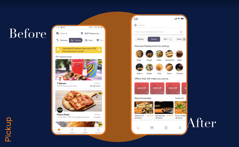
- A search engine is introduced to look up food and restaurant options.
- Users can now check out deals and discounts on the pickup page.
- The 'Recommended' section helps users to choose the most popular restaurant for the food item that they are willing to order.
Restaurant:
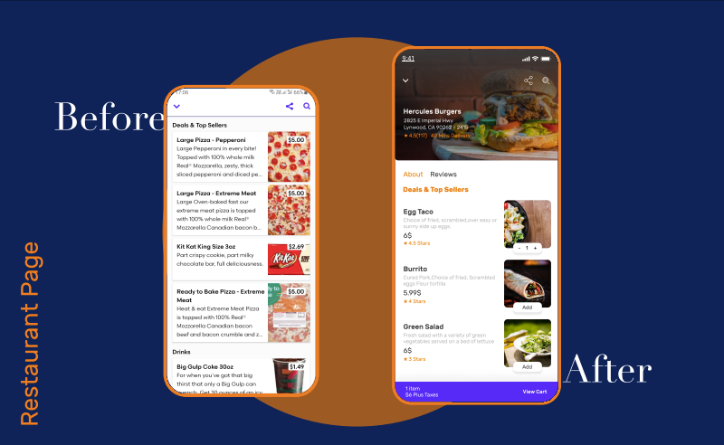
- Users can now read the details about a food item without having to move to a different page. They can keep scrolling, read more, and add food items to the cart.
- The cart updates are visible at the bottom navbar.
Cart:
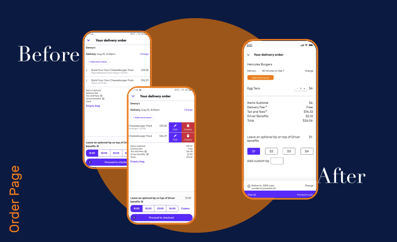
- Users can easily add or remove food items from the cart. The tips section is more cleaner.
- The user can view the delivery address on the same page and change it if needed.
Conclusion:
Online food delivery is a competitive market. Not providing the best user experience means you are slowly and steadily losing customers and consequently the business.
Following a transparent and humanized approach to designing UI/UX is critical. At Daffodil, we help businesses in customer acquisition and retention by creating a user experience for their app that works.
If you need the same for your business app as well, then our team is there to help. Connect with us through a free consultation session and you will surely get the best suggestions and roadmap for a business that thrives.
*Disclaimer: The intent of this post is to showcase the design expertise of Daffodil Software. We certify that Grubhub or any of its associates is not our customer and this redesign has not been contracted by them. Our product design team revamped the application of its own accord


