According to the ergonomics of human-system interaction, User Experience (UX) is a person’s perceptions and responses that result from the use or anticipated use of a product, system, or service.
In simple words, User Experience (UX) is everything that a user experience while he/she is associated with a product, system, service, or brand. That is why every entrepreneur who plans to create the next big thing pays attention to the UX details.
At Daffodil, we use the Design Thinking approach to build user experience for software applications. With this human-centered approach, we think beyond transactions and create user experiences that help businesses build lasting and significant relationships with their customers.
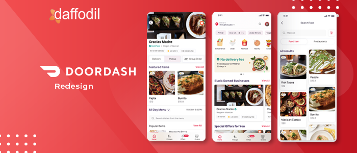
This time, our product design team utilized the design thinking approach to redesign one of the most popular apps- Doordash. The aim was to improve the user experience while negating the existing drop-offs.
Doordash Overview:
Doordash is an online food ordering and food delivery platform. It covers over 56% market share and is one of the largest food delivery companies in the United States. The platform serves 450,000 merchants, 20 million consumers, and 1 million deliverers (as of December 31, 2020).
Doordash has three user segments: Customers, Merchants, and Dashers. Customers are the users who order food online. Merchants are the partnered restaurants. Dashers are the drivers who are responsible to deliver the orders.
The Doordash customer app has more than 310,000 menus across 4,000+ cities in the U.S., Canada, and Australia. In the year 2020, Food & Drink app downloads surpassed 400 million. Leading the way, Doordash was the most downloaded app, followed by Ubereats. In May 2021, the Doordash customer app was downloaded 2 million times from the app stores.
Objective:
The objective of this exercise was to:
- Redesign the existing Doordash app to decrease the food order time by eliminating the drop-offs from the user journey.
- Enhance the user experience with minimal, clutter-free, and state-of-the-art design.
- Create a user-friendly design that captivates the users. Also, it should improve the core with elements such as colors, typography, and design elements pivoting around it.
Let us now walk through the design aspect of the exercise. It aims to redefine the meaning of consumer products and reimagine the experience that goes with them.
Design Process:
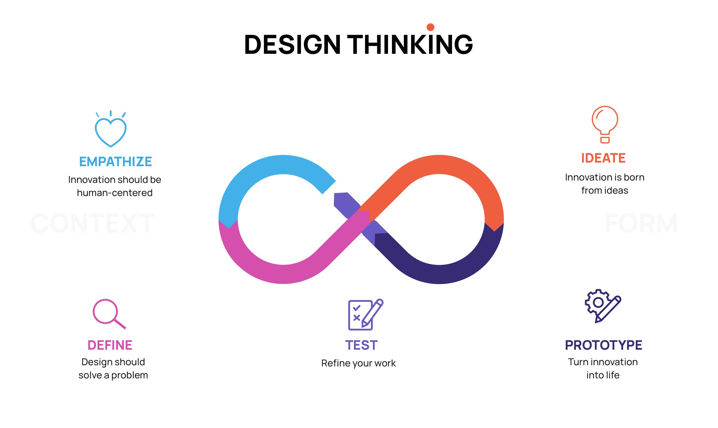
Design Thinking is a human-centered approach to problem-solving. There are 5-step to solve any problem following the design thinking approach:
Empathize: Understanding the persona, what are their sentiments, and what are their needs.
Define: Define the problem statement that needs to be solved and the challenges associated with it.
Ideate: Generate ideas, find potential matches, and solutions to solve the problem.
Prototyping: Turn ideas into simple, testable prototypes, create Minimum Viable Products.
Test: Test the app with real people and get their feedback.
Before we move ahead and redesign the Doordash app using the Design Thinking approach, let us dive deep into the steps involved in resolving the problem.
Empathize:
Step1: Define the Research Method
Before research or user interviews are conducted, it is recommended to have a plan in place. Therefore, we created a research plan that lists out the research goals and methods that will help accomplish the target. This research plan also estimates the timeline for the entire project.
P.S. - Although, Design Thinking and Design Sprint involve the same 5-step cycle, both of them should not be interchangeably used. Design Thinking is a broad map of what a UX designer would be doing over an undefined period to solve a problem. However, in the Design Sprint, every task has a defined timeline.
Our research plan has estimated a timeline because we are clear about the scope of work and the problem.
Step 2: Secondary Research
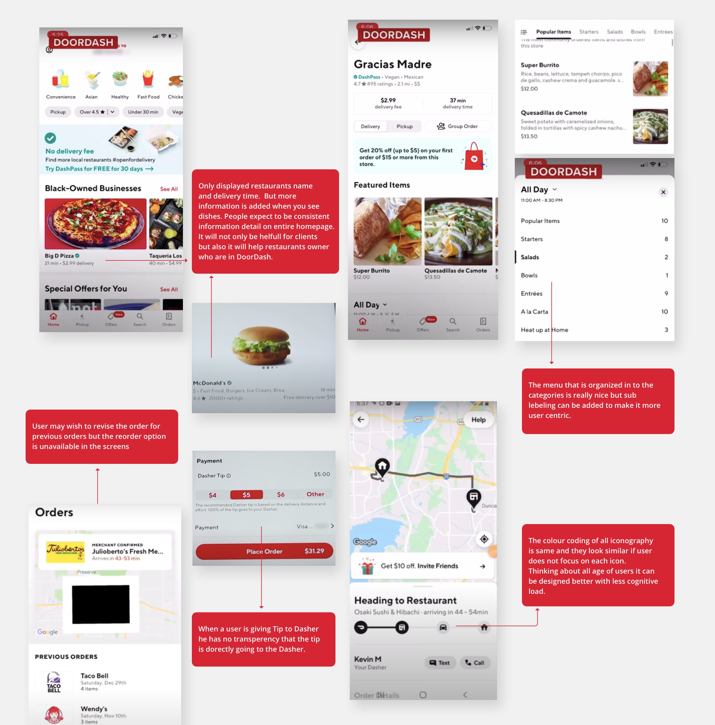
In this step, we generated some useful insights regarding the persona and their needs using the existing data over the web. For the Doordash mobile app, data in the form of comments from the Playstore, Apple Store, YouTube had been collected. We tried learning about users’ likes/dislikes about the app, the challenges they are confronting, tried to learn what do they expect in the app for their needs, etc.
Step 3: Primary Research (Surveys & Interviews)
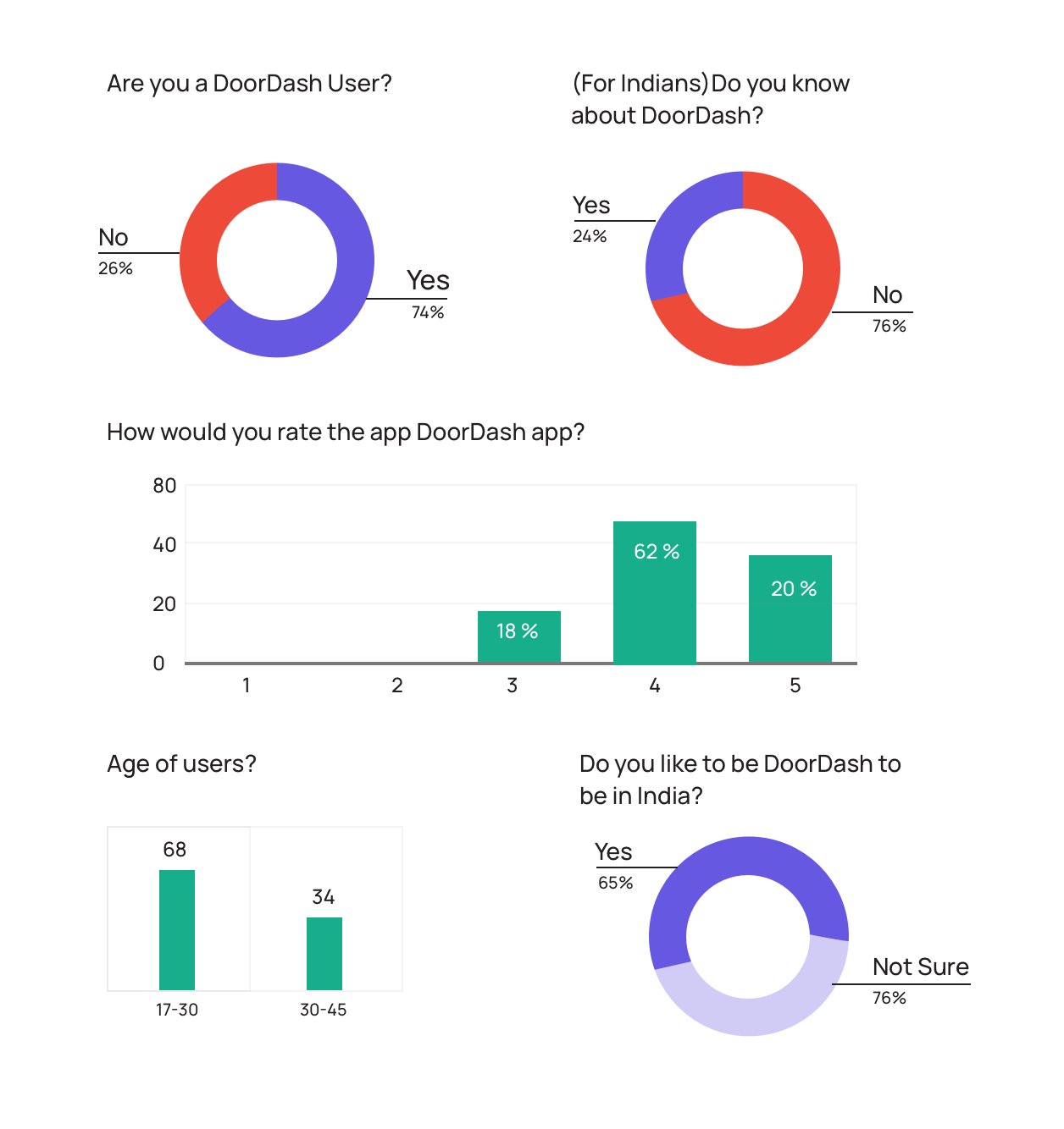
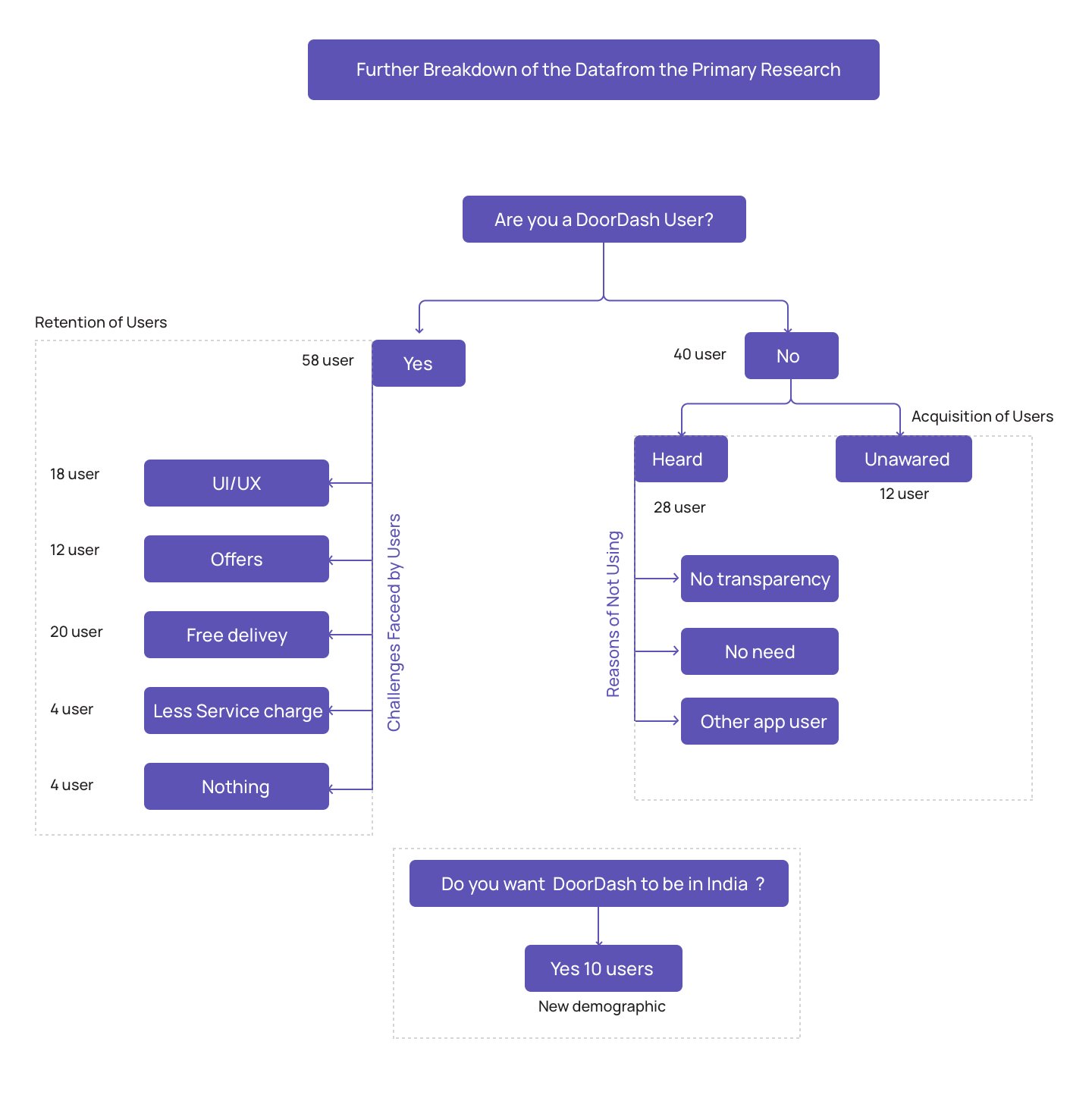
The secondary research helped us in creating hypotheses (user challenges with the app). However, it was crucial to validate the results of secondary research. For that, we conducted a small questionnaire survey that had a few subjective questions. The idea was to understand the common likes/dislikes of the app users for which we circulated the survey questionnaire to 110 people across different geographies.
The primary research helped us to collect meaningful information regarding the ‘what’ part of the problem. To understand the ‘why’ of user behavior, we went ahead with a couple of user interviews.
Define
Step 1: Choosing the Right Metric
There are 5 important metrics to define the growth of a company which are defined in the AARRR (Double-A Triple-R) framework. AARRR stands for Acquisition, Activation, Retention, Referral, and Revenue. For Doordash, we focused on the Activation, Acquisition, and Retention metrics.
Acquisition: Where are the users coming from and turning into customers?
Activation: How good is a user’s/customer’s first experience with the app? Are they able to fulfill their tasks or order the food with ease?
Retention: How many customers are retained and why some of the users are leaving the app?
Step 2: Analyze the Data (Affinity Map)
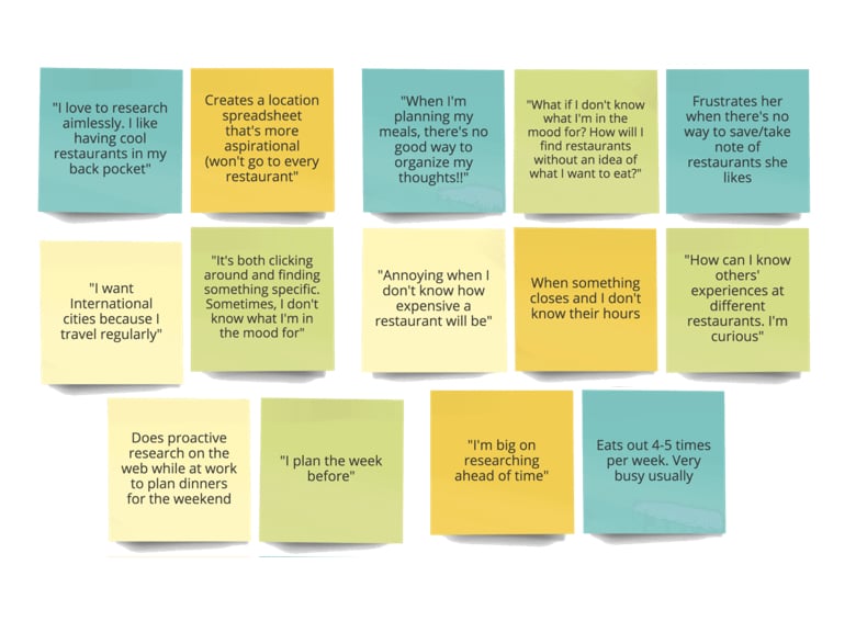
After gathering insights from the surveys, we created an Affinity Map which allows assembling data and then organizing them into groups/themes based on their relationships. We tried putting users with similar experiences into a similar group which helped us to understand the most common challenges associated with the user experience of the app.
Step 3: Persona
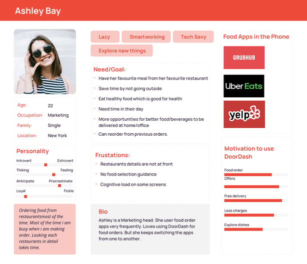
Based on the interviews conducted, we established a Persona that was referred throughout the design process. Persona helps to target the right customer segment, identify, and understand key pain points of the users.
Step 4: Customer Journey Map
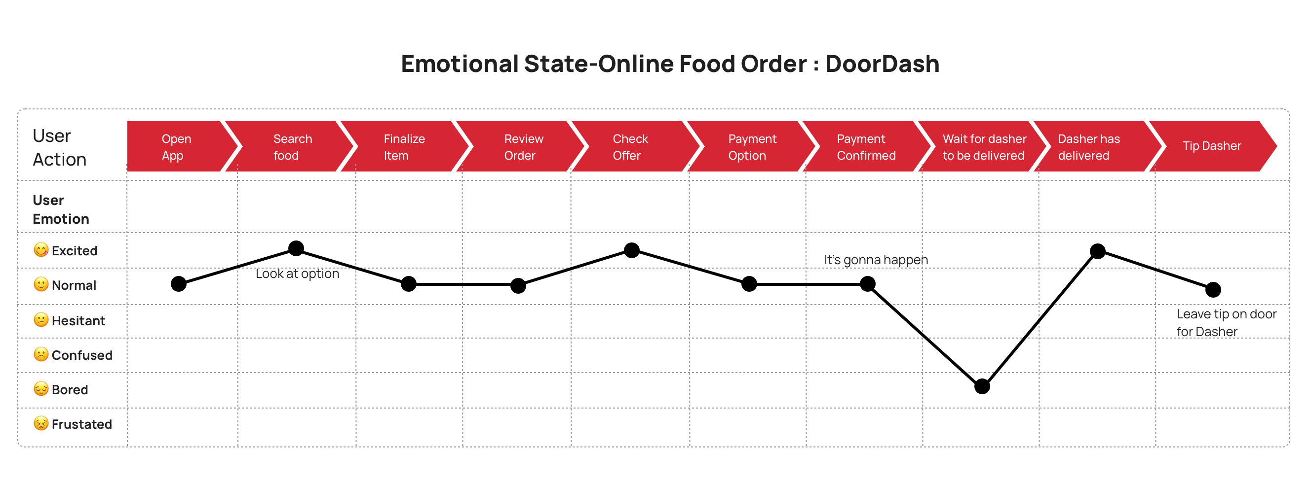
Based on how users interact with the app, a customer journey map was created. This map is a visual representation of customers’ experiences with the brand across all touchpoints. This map was a great help for us to understand the emotional state of users at each stage within the app.
Step 5: POV Statement
From the surveys, interviews, and the customer journey, we could analyze that the users were unsatisfied with the UX of the app. The inconsistency of information throughout the app is one of the major issues. Another problem that must be bothering the regular customers is that users can’t find the option to reorder from past orders.
From these insights, we created a Point-of-View (POV) statement. A POV is a meaningful and actionable problem statement that helps to ideate in a goal-oriented manner. A POV statement includes a user, need, and insight.
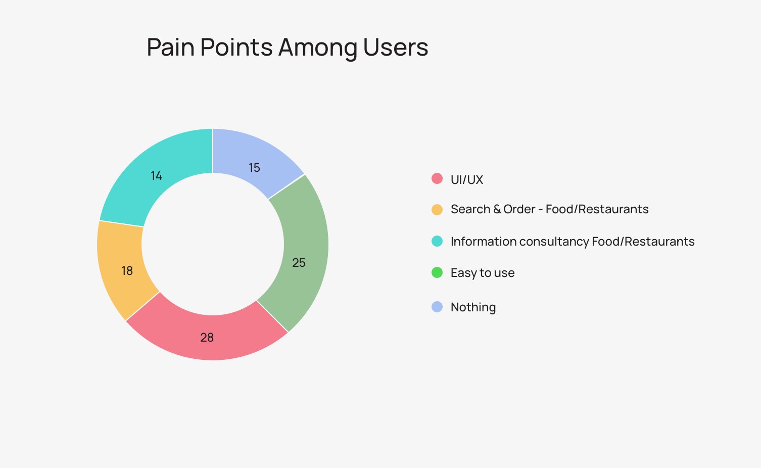
POV: Ashley is a 22-year old marketing person who uses Doordash app. She needs a seamless user experience because she has a busy day schedule and keeping herself healthy is an important part of her life.
Ideate
Step 1: How Might We?
We created How Might We (HMW) notes to reframe the problem statement and challenges into opportunities. For example,
- HMW make the app user-friendly?
- HMW make the app simple for the new user?
- HMW helps the user to explore food items?
- HMW enhances the tracking experience?
- HMW suggest reordering from past orders?
- HMW enhance order booking journey?
Step 2: Crowdstorm
Crowdstorming involves the target audience to generate or comment and approve the generated ideas. During the survey, we asked the users to share their suggestions to improve the Doordash app. Some of the responses included:
“Liked the old interface more”
“Make the app simpler to use, especially the restaurant profile”
“Better navigational steps in order journey”
“Search engine needs to be very easy to handle”
“The interface should be very clean and easy to use ”
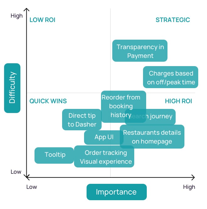
Based on the feedback received, we created a list of tasks that can help in improving the product. These tasks were plotted against the ‘Difficulty’ and ‘Importance’ matrix. This helps in prioritizing the tasks and features.
Prototype
Step 1: Sketching
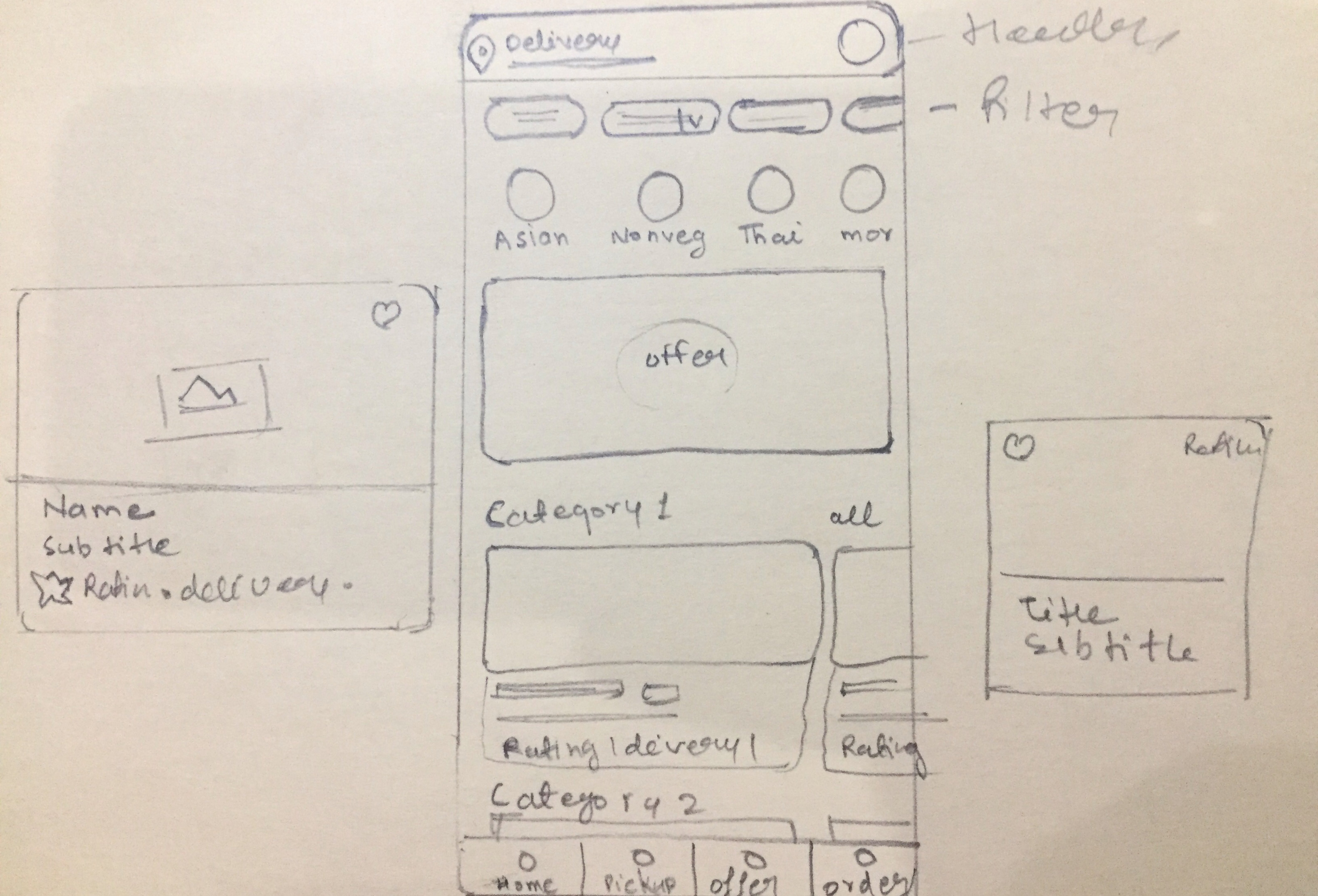
We started the design process with sketches. These sketches helped us visualize the ideas and validate them.
Step 2 - Low Fidelity Wireframes
During the Lo-Fi wireframe design, we kept ourselves in touch with the users to ensure that we were moving in the right direction.
Step 3: High Fidelity Wireframe
After testing the usability mistakes, We started designing the final screens in Sketch.
Font – Manrope
Platform – iOS
Colour- We kept the color the same as in the existing app
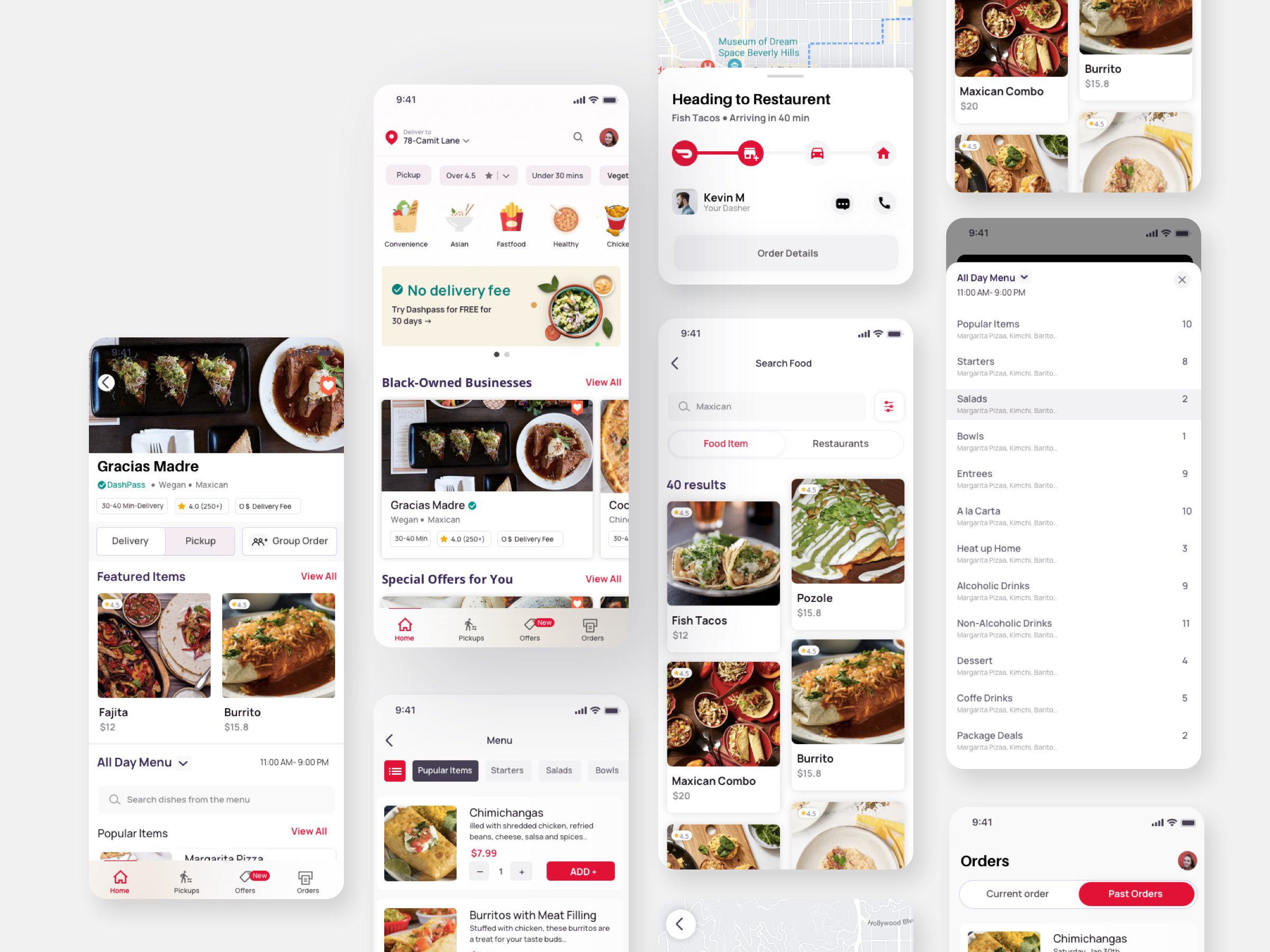
The changes in the app were expected to bring the following improvements:
- Clear visibility of restaurant information at front
- Information consistency and hierarchy maintenance throughout the app
- Better search and order tracking experience
- Better order journey
Testing
Step 1: User Testing
When all the high-fidelity wireframes were completed, we again connected with the users, asked them to test the designs, and check if their problem was solved. There were two types of users who were reached:
- Existing Users: Users who have been using the Doordash app for a long time.
- Non-Users: These users haven’t used the Doordash app ever. They had their first experience with the app.
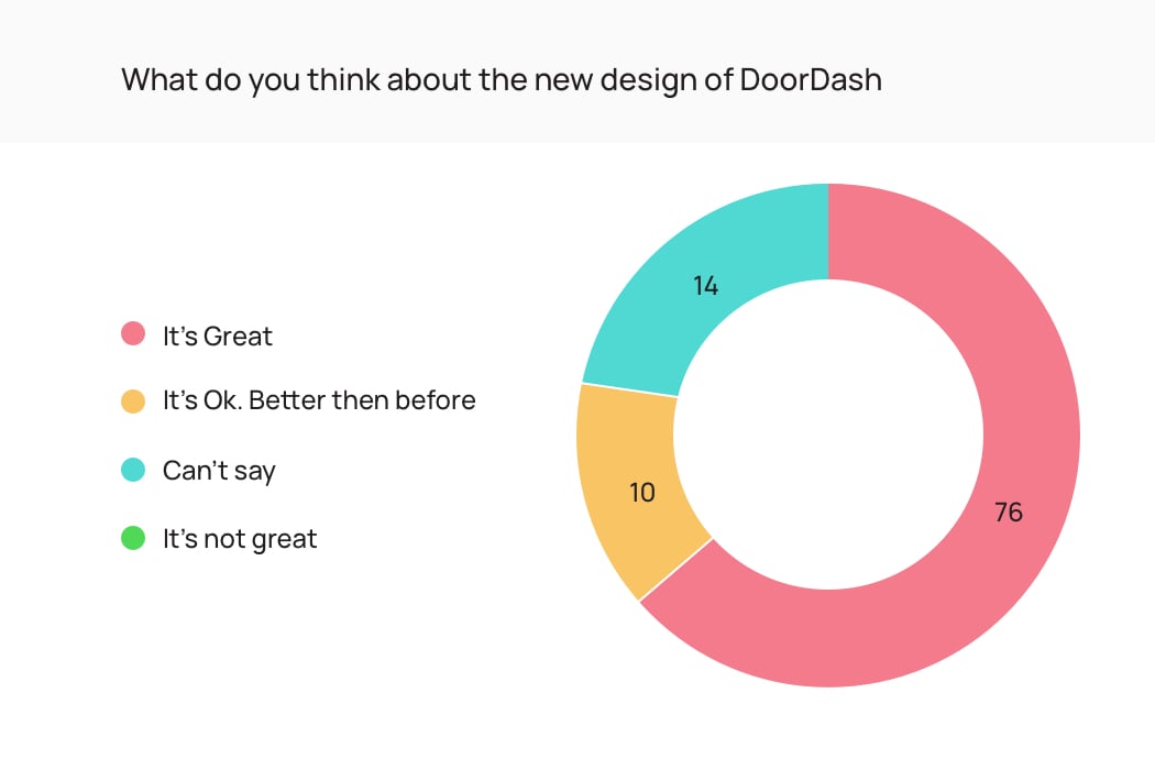
What Users have to Say about the Redesigned App?
Some of the users who were interviewed at the initial stage were asked to share their experiences and feedback with the new, redesigned app. Here are excerpts from the feedback received from some of the users.
“These redesigned pages have made the app content findable.”
I feel the new design is clean and has better placement of tabs and icons. This makes it easy to find the desired items on the app and it’s quite helpful to make informed decisions about the food items & restaurants.
“Usability of the app has improved a lot.”
The app options now look quite obvious. Food ordering, reordering, restaurant details, navigation, etc. have improved in the new app.
“I feel the app has got credibility and there are several reasons why I’m saying so.”
Usability is more than just letting a user complete a transaction. When a user can do the desired task with ease, the app earns a user and credibility.
Success Metrics/ KPIs:
The Doordash customer app had user experience challenges. Now that we have tried to fix them, we will track the success of this redesigned version on the basis of the following metrics:
Task Success Rate: How effectively a user is able to perform a task within the app.
Time on Task: How easily can a user find the desired information on each page of the app.
Explore vs Search: How effortlessly can a user find a specific food item or restaurant within the app.
Final Result:
What’s New?
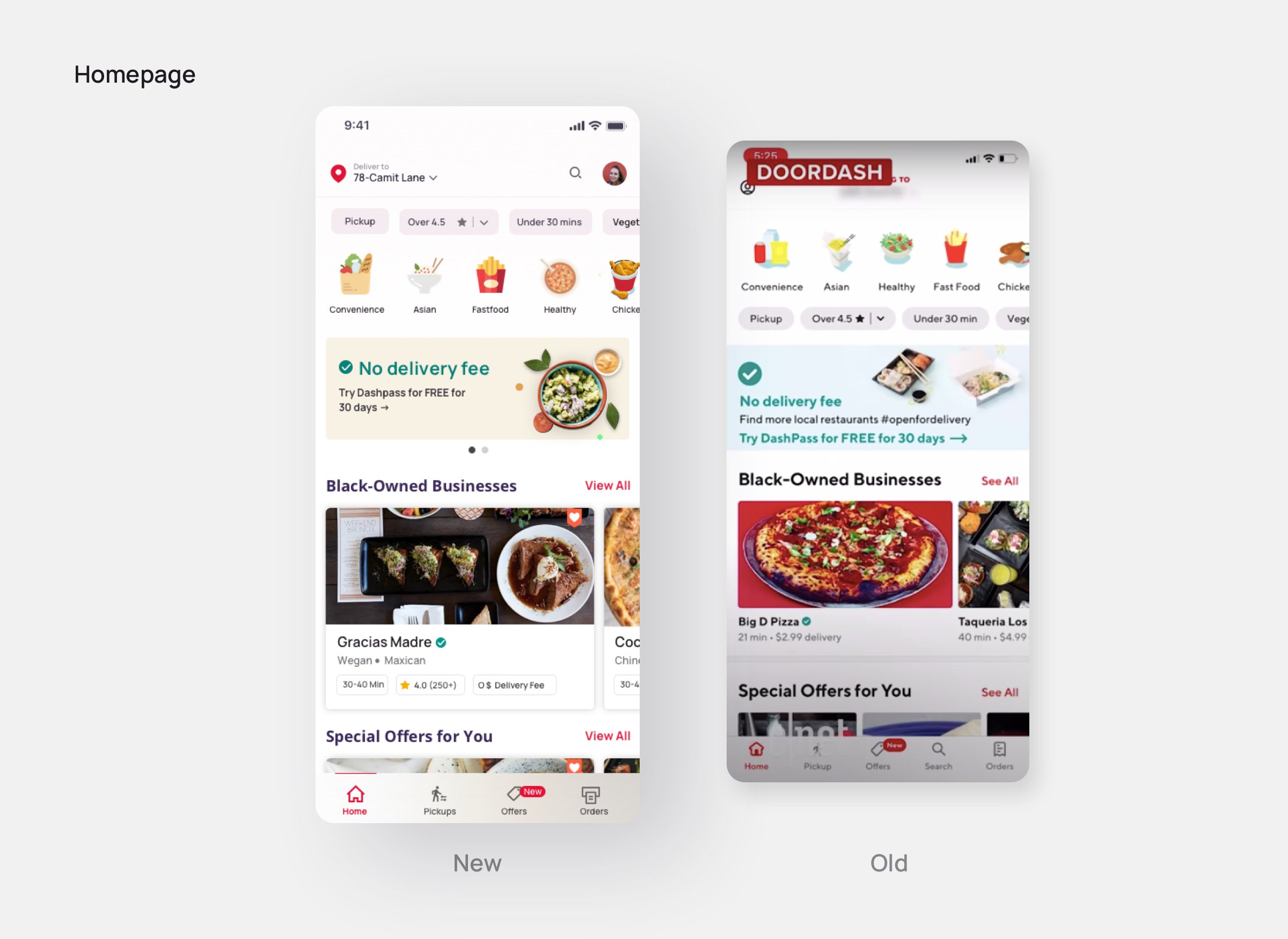
Ratings, expected delivery time, and delivery fees are some of the important factors that help users to make decisions. They were not added to the food & restaurant cards of the old design and were added to the new designs.
In the new design, the filter option is kept on the top so that users can easily filter their choices and then move ahead for the food order journey.
What’s New?
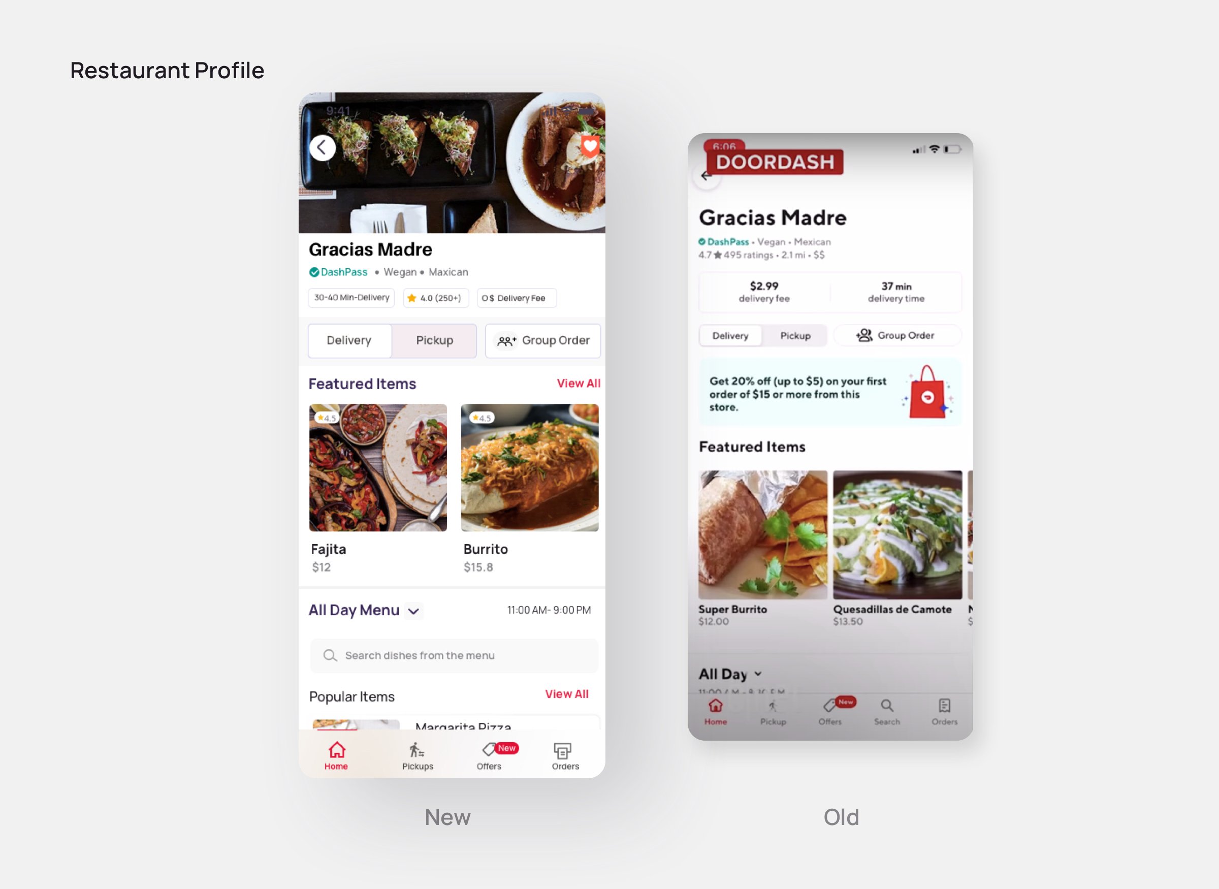
On the detail page of Restaurants, introductory visuals were added so that users can relate the type of restaurant with their needs. Information such as ratings, delivery time, delivery fees, etc. is presented in the same list view a before but with refinement.
What’s New?
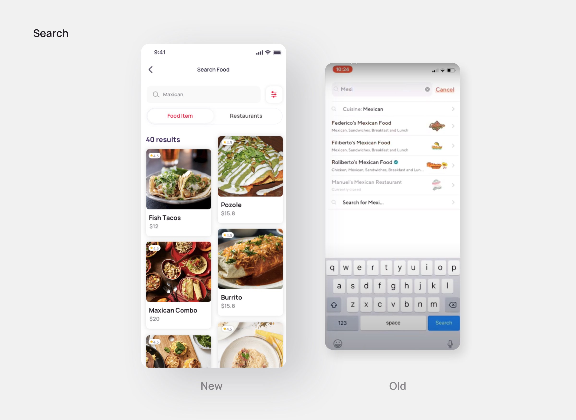
In the new design, users can easily filter food items and restaurants using relevant keywords. In the previous design, users could not filter food items and restaurants in results.
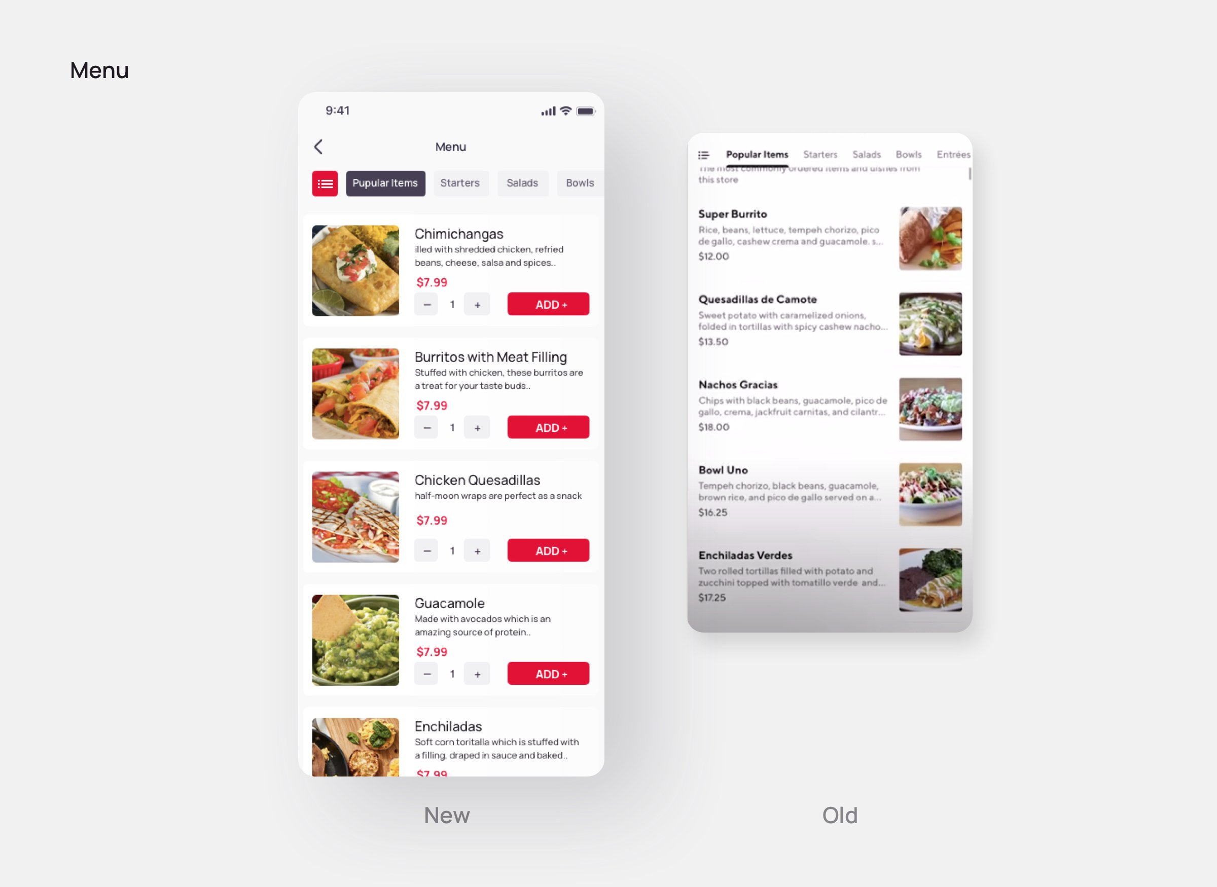
What’s New?
In the old menu, there was no option to add food items to the cart. Also, the feature on Group food items was not recognizable. In the new designs, these issues were resolved and navigation was improved.
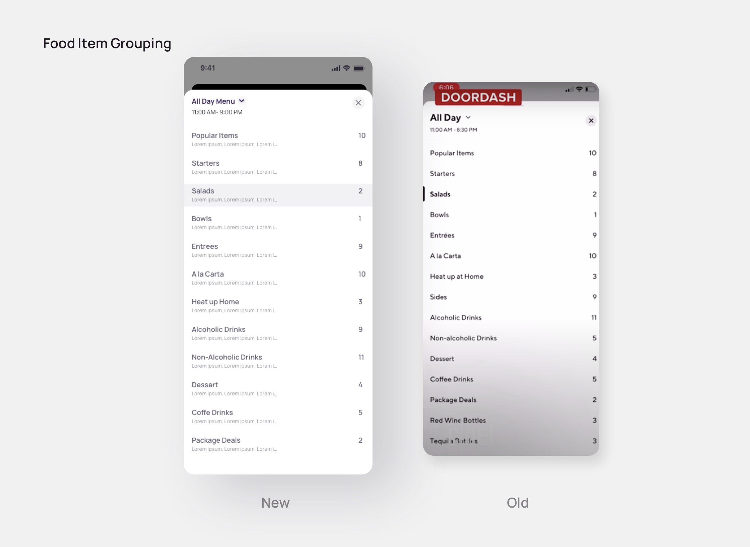
What’s New?
Grouping of the food items is an important part of a food ordering app like Doordash as it tells the user about related items available under one category. In the new design, users can have a glimpse of sub-items so that users can have an idea of items available under a group.
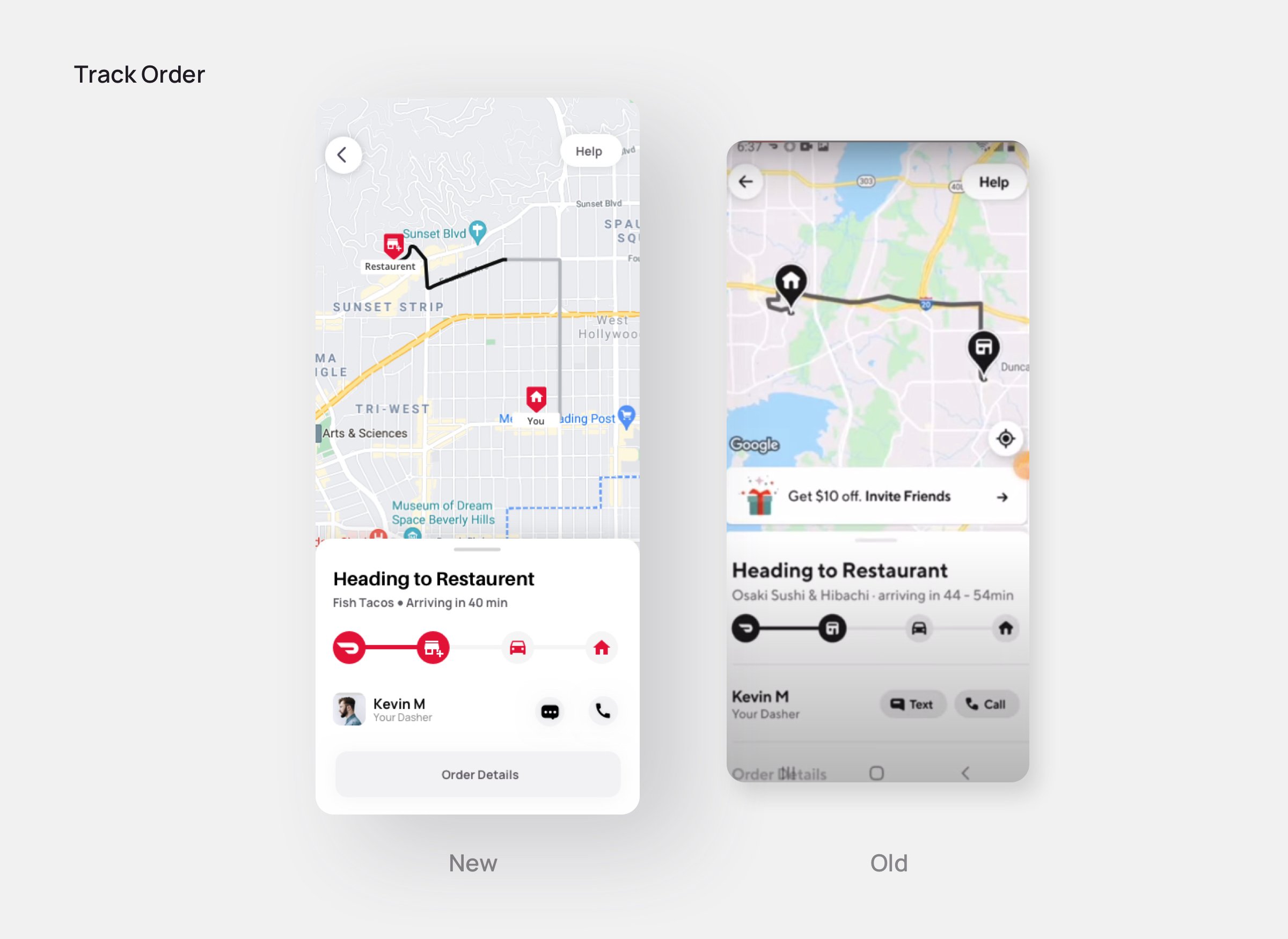
What’s New?
- In the old design, the black color is prominently used on the order tracking page. This has got a resemblance with UberEats.
- To make the page more friendly and unique, the new design showcases the current position of the dasher on the map with covered and pending distance.
- Brand color in iconography is used and a dasher profile photo is added along with his name for the ease of users.
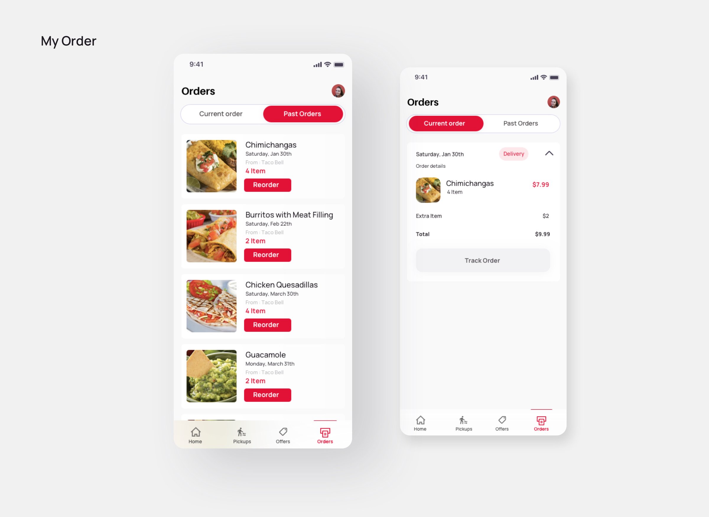
What’s New?
The new order pages are categorized in two tabs: Current and Past. Users have the option to reorder from their past orders if they want to repeat the same food item from the previous restaurant.
Conclusion:
The design thinking approach ensures that the final output of research is human-centered, i.e. what do the users want, what will ease their transaction journey, etc. And the fact that customer expectations continue to grow, UX designers have to analyze the requirements, identify the gaps, and fix them to provide a solution with better usability.
Just like we did for Doordash if you too want your brand design to be revised by our product design team to understand the impact it can bring on your business, connect with us. You can share your business details and requirements by setting up a free consultation call with our product design experts.
*Disclaimer: The intent of this post is to showcase the design expertise of Daffodil Software. We certify that Doordash or any of its associates is not our customer and this redesign has not been contracted by them. Our product design team revamped the application of its own accord


