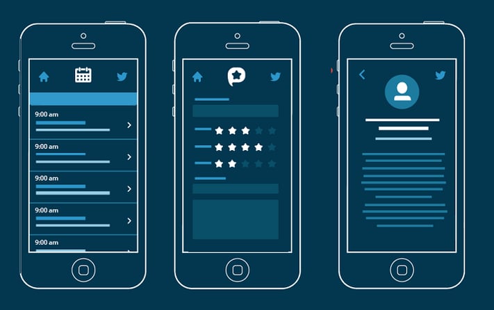
 User interactions have evolved during the last past years and it is really challenging for designers to keep up, making it tempting to use interaction design techniques when we build mobile apps. The manner and patterns in which we interact has changed and thus has changed the design linked with that interacting medium.
The manner and patterns in which we interact has changed and thus has changed the design linked with that interacting medium.
We saw the transition when we shifted from keyboards and mice to touchscreens to the 3D touch (being perfected by Apple). From entirely new interaction patterns to smaller interaction details and trends, every new device, environment, pattern, and gesture comes with possibilities and pitfalls.
It takes serious work to understand which design would suit your app the most. There are many thoughts in the mobile app UI/UX community which may or may not be helpful to you so before your kickstart your mobile app designing, here are some popular myths about mobile app design that you must stay vary of.
1.Account creation is necessary
This shouldn’t be a compulsion. A user would only want to sign up if he likes what he sees. You are making the user work before the benefit, make sure it is worth it.
As a developer, it’s much easier to lock users out until they’ve solidified an entry in the user database. It is most devious from a user’s perspective.
Instead, user data can be stored locally and eventually transferred to an account if and when the user ultimately decides to create one. Show off what you app can do before, create a lure before throwing the bait.
2. App tutorial screens are important for a new user
Explaining is much less effective than actual practise. If you are employing a tutorial before an app opens, then you are keeping the user devoid of learning through discovery. It is much more exciting and new to a user if he finds out about a feature by actual usage.
Users who swipe through instructions aren’t getting much out of the onboarding show.
3. What works for one app works for another
So perhaps the Twitter bird and the blue color makes the app design look pretty. But that doesn’t mean your app needs a bird to hold your guns.
The reason why some apps stand out is because they have unique mobile app designs and features. Unique meaning different and not another doppleganger trying to make it big.
The point is that we shouldn’t assume that the tried and true method is the only approach to making our app stand out.
4. App design = Responsive web design
No, no and another big no. While responsive design is similar to mobile app design, there’s a big difference between designing for any device versus standalone applications.
Users expect specific interaction patterns and interfaces in mobile apps. What is designed on the web often feels scattered or unpolished in a mobile app – not necessarily because something is wrong, but because it’s different.
Don’t port over web code and wrap it as an app strattera for depression. Design your app like an app and not for mobile web – everyone can tell the difference.
5. Default loading icons are the best
Default loading icons tend to have negative connotations like the slow app, internet or limited WiFi connectivity
Try to make loading spinners natural and use them to reinforce your brand. This is a perfect opportunity to use countdown-loading spinners or subliminal spinners to show off your brand colors and logo.
6. Users never disallow notifications
Build a custom “allow notifications” interface into your app rather than relying on the OS’s default permissions option.
Create a popup to tell users why your notifications are important and assure you you won’t be spamming them. You can disguise your popup to look like a system permissions popup and get all this work done.
For an app-based business, ignoring the wrong detail can be detrimental to app adoption or even sabotage your relationship with the user.
Never assume what’s good for the design, you need to work hard to find the best design solution for your app and users.
To learn more about mobile app development and design that would suit your app the best get in touch with our team at Daffodil and we would love to hear you out


