
In the initial phase of mobile app development, a lot of time and effort is spent to acquire users. The next phase involves holding-on to those hard-earned users, which indeed is a tough job to do. According to a research, an app loses 77% of its active users within first-three days of its installation, if they find it hard to comprehend its usability.
You may come up with an app having the most creative interface but if the user fails to use it well, they are likely to abandon it. Therefore, when the users get started with an app, make it a point that they know how to use it. For this, there are app walkthrough for users, explaining them the right way to use an app and get the best out of it.
Why your Mobile App Needs to Have a Walkthrough?
Not every app needs to have an onboard/walkthrough. Some apps are simple, self-explanatory, and hence their usage seems quite obvious to the users. On the other hand, there are apps that are large, a bit complex, and hence they need to have a how-to manual for the users. Below mentioned are some of the scenarios that will help you to conclude if your app actually needs a walkthrough.
- Your app has undergone major re-design and you wish to introduce your users with the new features, how to access and use them.
- Your app uses some non-standard mode of interactions like bespoke gestures (tapping twice, force touch etc).
- Your app has a lot of additional benefits, roles, or restrictions and to let the users know about it, a gude is necessary.
Now when you know that your mobile app should have a tutorial for its usage guide, you will start creating it. However, before you get started with it, it is important to understand that an app walkthrough should be small, precise, and engaging. Here we share some tips that will help you out to create a help guide that users will love read.
a) Say More with Less Words
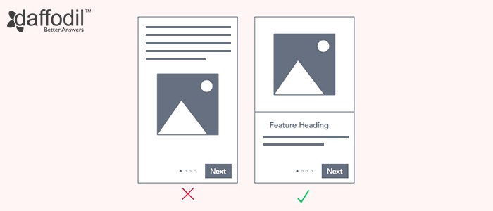
When designing an app onboard/walkthrough, it is important to keep the text scannable. Try to convey the instructions to use the app concisely. This can be accomplished through headings that sums up the point in just few words. To make it explanatory, you can add text descriptions underneath, but ensure that the text is scannable and is not long.
Also, try to place the text near navigation. This will draw user attention and will avoid their eyes to work too much. This way, they will read the text effortlessly and will navigate across the walkthrough screens faster.
b) Give Cues for Navigating
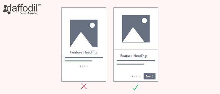
Sometimes, designers exclude navigation buttons from the walkthroughs. Instead, they include pagination dots, expecting users to swipe for next screen. This has two drawbacks: One, the user might miss a small visual cue and second, it’s not obvious to consider dots as an indication to swipe.
Don't make users put an effort while having a walk through the app. Add navigation cues like a “Next” button that can hint them about how to navigate. Buttons are easily visible and are one of the intuitive ways pass a set of instructions. However, you can still allow the users to swipe, alongside a Next button to move forward.
c) Place Call-to-Action at the End
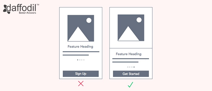
It is not a good practice to place the call-to-action button at the beginning of the walkthrough.In that case, the user might skip the tutorial screens as they might find it useless to go across it. As a consequence, they can get confused and look out for help page. It is important to maintain a user’ interest in the walkthrough to ensure that they understand the app functionality, in order to get the best out of it. Therefore, placing the call-to-action button at the end is a sensible practice.
d) Focus on HOW than WHAT
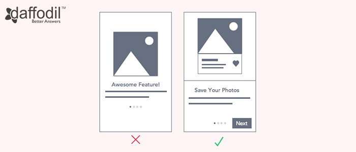
An app walkthough is meant to answer the How it functions. Don't do the mistake of selling the app features. If your users have already downloaded the app, it is obvious that they are clear with what your app does.
Lay emphasis on how to use the app. The images should display user interface and point out what users need to do on it, i.e. swipe, tap, add info etc.
e) Make it Accessible
Once the users are done with the mobile app walkthrough, possibility is they want to have a look at it again. Therefore, make sure that it is easily available to the users again. You can do this by placing a link in the navigation menu and name it as Tour, How-To, or Tutorial.
ALSO READ: Tips Blend UI/UX with Human Psychology During Mobile App Development
Think from a First-Time User Perspective. That’s Important.
Before you start to design an app walkthrough, consider the gaps that your users can encounter. A user never wishes to invest his time learning how to use the app and rather want to complete a task in the shortest time span. Make that happen and you will earn a user, for ever.


