With the introduction of Google's Material User Interface concept, developers have already started updating their mobile apps with advanced design components such as buttons, dialog, dropdown menu, icon buttons, inputs, switches, toolbars and more for a brand new look & improved UI. But no matter how thoroughly you read the specified design guidelines, most of us still wonder while taking the switch from Holo (the dead Android Theme Google first introduced with Android 3.0 Honeycomb) to Material Design concept.
This blog explores Material UI in detail and discusses how you can apply the material theme to create an Android App along with the set of react components implementing Google's material design.
When you're creating a brand new Android app with material design features, you probably don't know the design specifications applicable to the cohesive CSS framework. So, to get started with Material UI, you first need to review the material design specifications documented by Google. And then you can use the new functionalities offered by the Android Framework to design & develop your android app.
Having done that, you can proceed to apply the material theme to your app once you finalize on your design concept. The only way to do this is to specify a style that inherits from the class android:Theme.Material as shown in the below code-
[php]<!-- res/values/styles.xml -->
<resources>
<!-- Your Android app theme inherits from the Material Theme -->
<style name="AppTheme" parent="android:Theme.Material">
<!-- Theme Customization -->
</style>
</resources>[/php]
After this, you can create your own layouts keeping in mind the material design guidelines while also specifying the elevation of your views to cast shadows. Now if you also wish to create lists & cards for your Android app, which is usually a common phenomenon while designing mobile apps, you can use system widgets based on Material UI components via using the Material UI kit. These widgets let you set your own color palette and default animations for touch feedback, animations & other activity transitions.
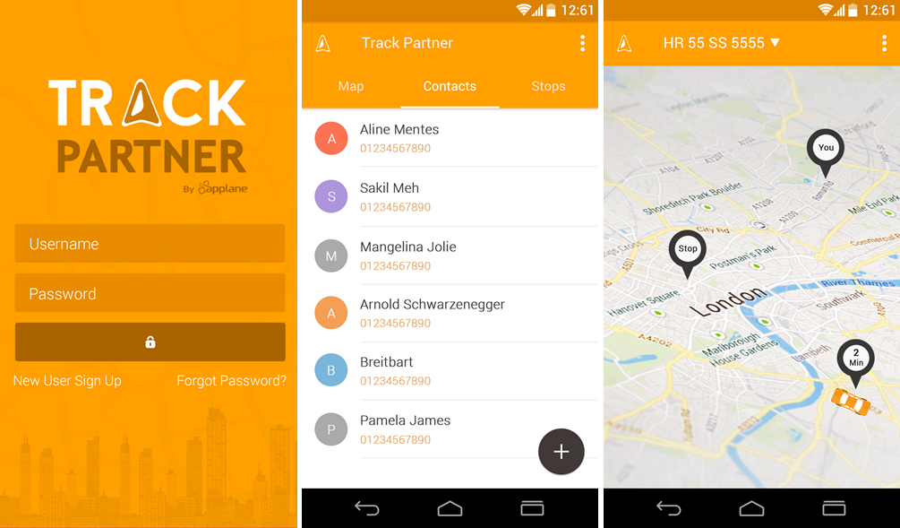
As an example, I've shown screenshots of our most popular app Track Partner below. Our mobile application development team successfully designed this app using material UI theme and creative design concept.
At times, you're extremely short of time and resources. In such a case, the only option you have is to update your existing mobile app rather than designing it from the scratch if you're actually serious about incorporating material design. Sometimes you may even want to add custom animations or touch feedback in your existing app to ensure a fantastic user experience and awesome UI. To do both these things, you just need to update your app layouts while following material design guidelines and you're all done with incorporating material UI in your existing mobile app.
Though there's a lot of stuff that you can go on doing with Material UI besides adding a material theme or updating your existing app, the most important thing developers often ignore is preserving compatibility with different versions of Android. While using material design features for your app, maintaining backward compatibility is extremely crucial.
I hope you've enjoyed reading the blog!! Stay tuned for more such interesting stuff !!