Dries Buytaert, the founder of Drupal, was quoted while saying "If I were to start Drupal from scratch today, I'd build it for mobile experience first and desktop experience second".
Drupal 8 was uncloaked in its Beta stage last year in October and since then it has been a subject of colloquy. A sundry of new features have come sprawling out of the Drupal workshop including massive Multilingual Support, Built in Web Support, Effortless Authoring with the bundles CKEditor and WYSIWYG Editor.
But up until now the cardinal feature that stands up to be counted is certainly the Mobile-Friendly feature, which Drupal has proudly related to as its 'DNA'.
Mobile Responsiveness is the new Meta; keywords like "Mobile Friendly", "Responsive", and "Squishy" are selling in the marketplace like hot cakes. What responsiveness plainly means is that your content can be easily accessed, viewed and analyzed on mobile screen equally as well as on the desktop screen. Stretched menu items become drop downs, images resize and columns adjust.
Drupal 8 has made Mobile Responsive design a pivotal part of itself and from the Beta versions we have tested it looks pretty neat. Considering the Newly changed Google Search Algorithm that has brought about a "Mobilegeddon", Mobile Responsiveness has established itself as the rudiments of Tech growth.
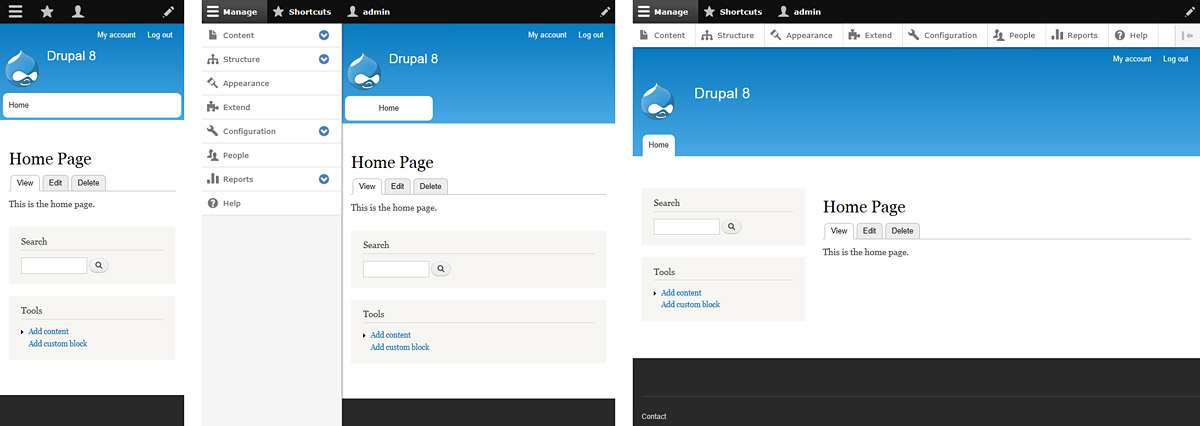
In this post we will not venture into the vast amount of Drupal 8 features but we will lucidly talk about a few of Drupal 8's mobile friendly features, how it can get your website up and running.
Responsive Design In Drupal 8
Drupal 8 is bundled with Mobile First in mind. Now you can manage your website's content on Drupal 8's responsive interface and its all new admin toolbar.
All core themes have become responsive and flow elements such as menu items fit well into the mobile screen. Large images that show up desktop will be suitably scaled down to fit faultlessly into your mobile screen.
So how does Drupal manage to do all this? Simply by using two modules called Breakpoint and Responsive Image.
Breakpoint: Breakpoint is used to make changes to your website at different sizes. Breakpoint helps you to identify the height, width and resolutions breakpoints where the design of your website starts to crumble in a mobile interface. It is a splendid built in tool that can help design your responsive design accordingly.
But even at this level of convenience, one requires a front end developer and a site builder to materialize the responsive theme.
Responsive Image: Just like Breakpoint, this module helps you in identifying the height, width and resolution breakpoints of an image and guides you to set appropriate resolutions for an exquisite responsive design.
Unlike Breakpoint, Responsive Image is not enabled by default and here you do get a concrete user interface to configure your images the way you want them.
The features may sound elementary but their impact is multitudinous. The sheer offering of a responsive design can make your business soar heights and with Drupal 8 you are getting everything served on a platter.
We have been painstakingly working on the new Drupal 8 platform and everyday there is a new challenge and a new discovery. Drupal 8 is exciting, fun and full of opportunities for new and old businesses alike.
I hope you enjoyed reading the blog. Please share your views with us and feel free to contact our team if you wish to get more information about Drupal 8 and all its perks to your website.